The Death of the Logo

The suit is cream linen. The shoes are black and highly polished. There is a martini on the table and a chess board to the left and a gold watch on the wrist. Nothing in this image has a visible logo. Nothing needs one. The man wearing these clothes does not need you to know where they are from. He already knows. That is the entire point.
 This is what quiet luxury looks like in its purest form: not the absence of taste but the absence of announcement. Clothes that speak to people who already know the language — and say nothing at all to everyone else. It is, depending on your perspective, the most refined thing in fashion or the most exclusive. Usually it is both at once.
For the better part of three decades, fashion moved in the opposite direction. The logo was not decoration. It was infrastructure. It told you where the wearer stood, what they had achieved, which world they belonged to. The monogram was a passport. The interlocking letters were a handshake. You wore the name so that the name could do the work of introduction for you.
Then, quietly — the word is appropriate — something changed.
The Original Template
Before the logo era, there was another way of signalling status. It was older, more embedded, and far harder to acquire because it could not simply be purchased. It was the aesthetic of inherited wealth: the house that has always looked this way, the coat that came from a grandfather, the chair worn smooth by three generations of the same family sitting in it.
Brideshead Revisited, Evelyn Waugh's 1945 novel and the 1981 television adaptation, remains the definitive visual archive of this mode. White linen in summer. Cream trousers. Oxford bags. Clothes that look as though they have been worn before and will be worn again. The aristocrats in Brideshead do not dress to impress. They dress as though the question of dressing has been settled for so long that it no longer requires conscious thought. The clothes are simply what one wears. They have always been what one wears.
This image — a man in a paisley smoking jacket, dogs at his feet, surrounded by the accumulated objects of a very long family history — is not fashion in the modern sense. It is the thing fashion has been trying to replicate ever since it understood that some forms of status cannot be manufactured. The jacket is ornate. But the ornateness is in the fabric, the cut, the occasion — not in a logo. He is not wearing a brand. He is wearing a life.
The Logo Era
The logo came to dominance in the 1980s and never fully left. What drove it was democratic in impulse and aspirational in effect: if you could afford the bag, the belt, the monogrammed jacket, you could wear the same symbol as the person who inherited their money. The logo was the great equaliser — or appeared to be. It gave everyone access to the signal, if not the substance.
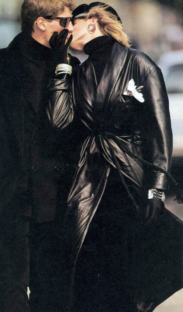
 The eighties understood this perfectly. Fashion in that decade was designed to be read from a distance: big shoulders, high contrast, visible hardware, names worn on the outside. The leather coat, the rhinestone bracelet, the dark glasses — this is fashion as power projection, as theatre, as the deliberate construction of an image. There is nothing quiet about it. Quiet was for people who had nothing to say.
The nineties complicated this. Minimalism arrived as a counterargument — Helmut Lang, Calvin Klein, Jil Sander. Clothes stripped back to structure and fabric, the logo either removed or reduced to a near-invisible whisper. But even nineties minimalism retained a kind of performance. The cigarette. The sunglasses. The awareness of being watched.
This image is minimalism, but it is not quiet. The silhouette is deliberate, the attitude is projected, the presence is total. It is the brand of "no brand" — which is itself a brand. Fashion has always understood that the rejection of signalling is itself a signal. The question is only what you are signalling, and to whom.
Why Quiet Luxury Won
The shift happened gradually and then all at once. The 2008 financial crisis made visible wealth embarrassing in certain circles — logo bags on the arms of people who had just lost everything. The rise of tech money brought a new ruling class that dressed in fleece and trainers, for whom the traditional markers of status were irrelevant. And then Succession happened.
The Roy family — fictional American billionaires — dressed in clothes that cost more than most people earn in a month and looked like they cost nothing at all. Cashmere that had been washed so many times it had lost its sheen. Shirts with collars soft from use. Loafers without buckles or hardware. The costume designer, Michelle Matland, understood that the truly wealthy do not need their clothes to make an argument. The clothes simply fit. The fabric simply drapes. The rest is silence.
Social media accelerated the trend in the way social media accelerates everything: by creating a new aesthetic category, naming it, and producing thousands of images that define its parameters. "Old money aesthetic." "Quiet luxury." "Stealth wealth." Suddenly, a visual tradition that had existed for centuries had a hashtag. And with a hashtag came democratisation — and with democratisation came the same question that has always haunted fashion: if everyone can adopt the aesthetic, does it still mean what it meant?
What It Actually Looks Like
Quiet luxury is not minimal in the sense of empty. It is precise. The fabric is the point — cashmere heavy enough to hold its shape, linen that wrinkles in the right way, cotton washed into submission. The cut is the point. The colour is the point — cream, stone, navy, camel, olive, the palette of things that do not shout.
 Damson Idris — actor, one of the most watched men in entertainment right now — said it plainly when this photograph was taken: "I've always loved fashion." Not streetwear. Not hype. Fashion. The distinction matters. Green ribbed knit. Cream pleated trousers. A single gold bracelet. No logos anywhere. The background is warm and plain. The clothes are doing nothing except being perfectly themselves — which turns out to be more than enough. This is what it looks like when someone who could wear anything chooses restraint. Not because they have to. Because they understand it.
And then there is the watch. One watch. Square case, Roman numerals, blue crocodile strap, gold cufflink resting beside it on a chess board. No diamonds. No complications. No name visible from a distance. This single object communicates more about taste, wealth, and knowledge than a hundred logos ever could — precisely because it requires the viewer to already know. The logo shouts. The watch whispers. And the people worth impressing have always preferred a whisper.
Lagos and the Quiet Register
Lagos has always understood both registers — the spectacular and the restrained — and has always known when to deploy each one. The Lagosian who arrives at a dinner in a perfectly cut cream suit, no visible branding, fabric that drapes like water: this is not someone who cannot afford to show off. This is someone who has decided, tonight, not to. The decision itself is the statement.
Quiet luxury did not invent understatement. It did not discover that quality speaks for itself. It gave a name to something that certain people in certain places have always known — and then sold that knowledge to everyone who was willing to pay for it.
Which is, in the end, precisely how fashion works.
The logo was never really about the brand. It was about the need to be seen. Quiet luxury is about something older: the confidence of knowing you already are.